Showing posts with label ink. Show all posts

Monday, February 19, 2007

Ink Monster T-Shirts

My most recent assignment for my Digital Art class was to create a series of T-Shirt Illustrations with some sort of common theme. I had several ideas, but with time running short and some opportunites for my initial ideas already passed I decided to revisit one of my past favorite projects, ink monsters. I sat down for a few hours and drew up a bunch more and had some friends help me pick out the best ones to use for the T-Shirts. Here's what I ended up with.


The originals are all black and white, most on 9x6" bristol, in ink.

~Adam

Tuesday, January 09, 2007

More Black and White Illustrations

Here's the next two that I said I would do.


~Adam

Thursday, January 04, 2007

Illustration I (Week 1)

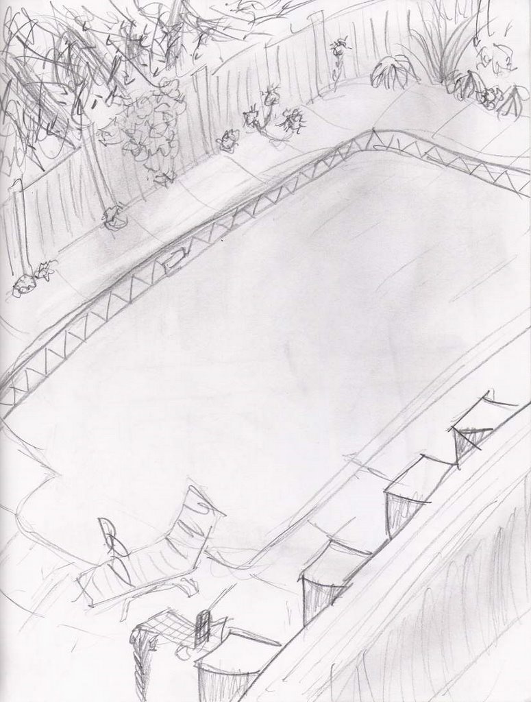
I started my 3 week mini-mester course, Illustration I, this week. So far it's not too bad. I was a little because I saw the class was scheduled from 10-4, and 6 hours in class sounded like a little hard to handle. As it turns out I only need to be there from 10-12:30 so it's actually shorter than most other studio courses. Though, I end up needing a few hours after each class just to finish up the work for each day.

These are what I've done so far :

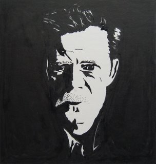
A cross-hatch drawing of Clarence Long, the original Marlboro Man. It was my first time I've really done a full drawing in this style, so I don't think it turned out great, but the method doesn't really interest me much to begin with so I don't care.

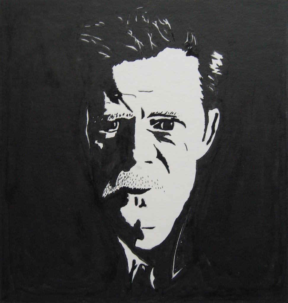
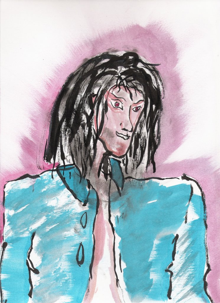
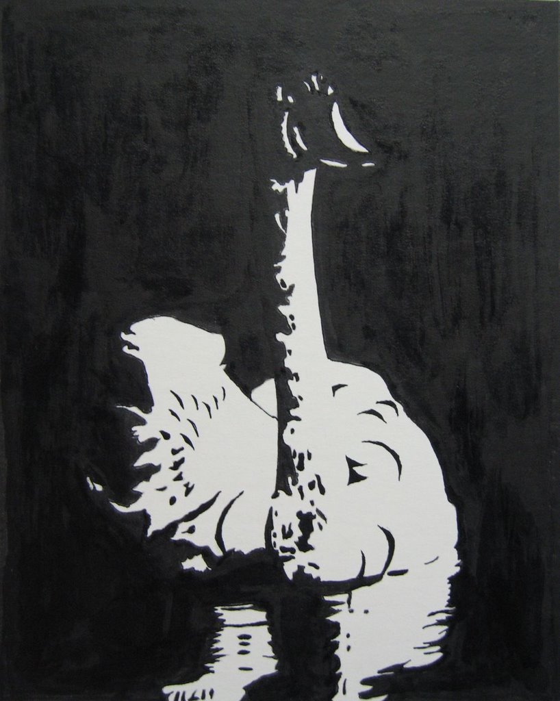
And second, a black and white side-lit portrait of William Macy, you may have seen him in Fargo or a dozen other movies. This one went much faster than the cross-hatching, but I still think it's a somewhat lame project because Adobe Illustrator can do this very same thing in about 10 seconds. I don't see what the benefit of doing it by hand is. (This is one of the reasons I'm focusing on digital Illustration.)

Anyhow, I have to do one more in each of these styles by the end of the weekend, so expect to see more like these soon.

~Adam

Tuesday, December 19, 2006

Ink Monsters

Inspired by Stefan G. Bucher's DAILY MONSTER (which is really cool and I recommend everyone check out) I did a few quick little monster drawings with ink. The initial form is created by putting a drop of ink on the paper and blowing through a straw to create organic shapes. Then it's just a matter of what your imagination sees. Fun and easy.


~Adam

Monday, October 02, 2006

Drawing and Splash for Painting : Week 5

I decided to start working a little early on my painting for this week, the last few I had done the day before they were due. I looked around for a good spot to work from with an interesting view. I went with the porch of the master bedroom, as seen in my recent diptych. I did a couple sketches of different view to see what looked good.


I decided the view of the clematis and the side of the house looked better so I did some further study by doing a couple quick splash paintings. Here's one :

I'll get started on the final painting tomorrow. It's going to be 20"x20" on canvas. The layout will obviously be slightly different because it's square instead of rectangular. Hopefully I can keep a similar composition because I like where it's going.

~Adam

Wednesday, August 23, 2006

Witch Splash

I did a few more color splashes tonight. A witch sort of character and a knight of sorts. Maybe a minotaur in armor? It's just whatever popped in my head first when I saw the splash. The colors are actually a good deal brighter than they appear, I'm not sure why the scans turned out so dull.


~Adam

Tuesday, August 22, 2006

Color Splash Art

Well I finally sat down and tried to do some Andy Lee style art like I've been saying I would. It is, of course, not nearly as easy as he makes it look. But as I went on I think there's improvement.

The first is a match between Sagat and Ryu of Street Fighter. I wanted to do something for Illustration Friday's topic, "match", and I had action figures of those two characters. It was my first attempt at the style, so it's not great, but fun to do.

The next is a character I created, and am still trying to get the look of him down. I actually had Andy paint a couple ideas of him for me after I described him. Here and Here. Here's mine.

And finally, I was running out of ideas and this splash just looked like a weird face, so that's what I went with. I think this one actually turned out best of them all.


Enough for now, I'm sure I'll get better as I go.
~Adam

Wednesday, July 26, 2006

That's Right I'm Back!

I just got back from an awsome week in San Diego with my friends. I went to the Interantional Comic Convention while I was there and saw lots of cool stuff. I'm not going to waste your time talking about it here, but if you're interested I've created a blog dedicated to pictures and stories about the trip here.

The most notable part of the trip for me was getting able to hang out with Andy Lee and his girlfriend, Heather, and to watch him paint. I met them a couple months ago in Philadelphia and was wowed by his ability and have been trying to learn to do it myself. After spending several days watching him work I think I picked up a few new tricks and I couldnt wait to try them out. So here's what I've done so far.


This "splash painting" is really fun and helps stimulate my imagination, so look forward to more like this.

~Adam

Tuesday, July 11, 2006

Skylines

I always like to draw architectural stuff, so this week's Illustration Friday topic was pretty good for me. The other night I got an idea to do somethings with a sort of stencil creation of mine. And today I was in a sumie ink and brush mood. So here are all the things I ended up with in relation to "Skyline".
(as always, click for larger views)


~Adam

Tuesday, July 04, 2006

All Kinds of Things

I've been doing a few random different things lately. Here's another tower piece. I wanted to do something that wasn't drawn, only painted. Not sure how I feel about it. It would probably work better on different paper and more time to dry between colors.

Here's a drawing of "The Academy" that I did a week or two ago and jsut colored today.

Here is a classic "Star Wars" movie poster that I'm remaking using only construction paper :)


And here's a neat looking photo of some inks that I was mixing.

~Adam

Friday, June 30, 2006

Further Tower Views

I thought Lorey's idea of series based on the tower I designed was cool so I went ahead and did two more pieces today. Unfortunately my scanner is just barely smaller than the pages in my sketchbook so some of the edges are cut off. Anyhow, here they are.


I think I got a little too drastic with some of the shadows in the "Tower Beyond" piece, and the shape is not quite the way it should be in the "Tower Above" piece. Besides that I'm pretty happy with them. What do you think?

Here is a photo of the "Tower Beyond" piece so you can see the tower better. The colors are not as true, however.


~Adam