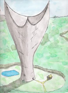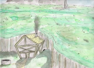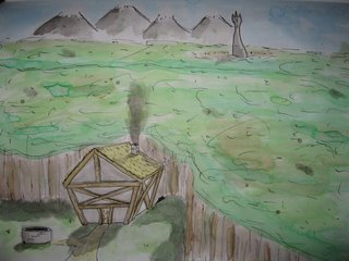

I think I got a little too drastic with some of the shadows in the "Tower Beyond" piece, and the shape is not quite the way it should be in the "Tower Above" piece. Besides that I'm pretty happy with them. What do you think?
Here is a photo of the "Tower Beyond" piece so you can see the tower better. The colors are not as true, however.

~Adam
