Monday, February 19, 2007

Ink Monster T-Shirts

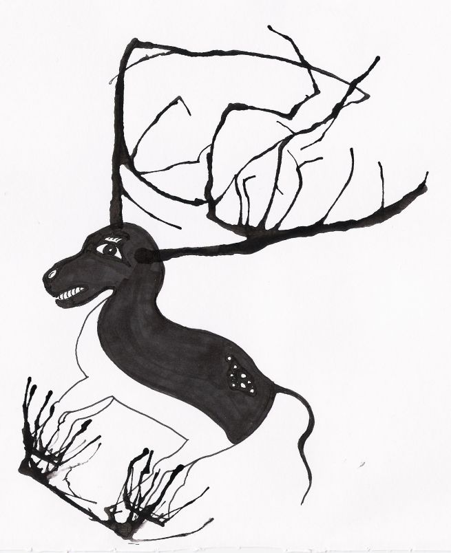
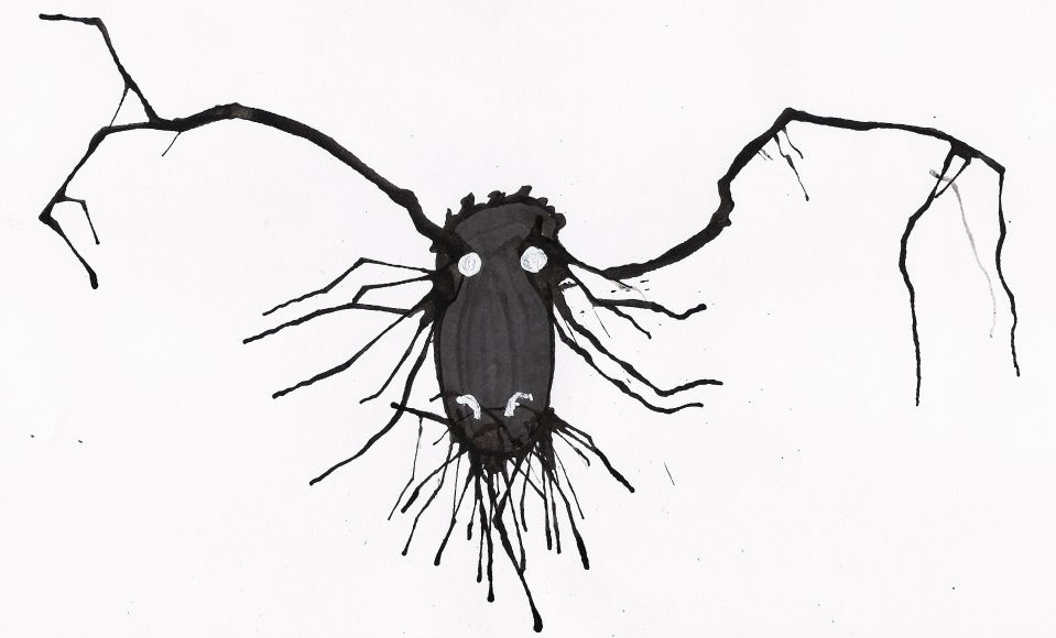
My most recent assignment for my Digital Art class was to create a series of T-Shirt Illustrations with some sort of common theme. I had several ideas, but with time running short and some opportunites for my initial ideas already passed I decided to revisit one of my past favorite projects, ink monsters. I sat down for a few hours and drew up a bunch more and had some friends help me pick out the best ones to use for the T-Shirts. Here's what I ended up with.


The originals are all black and white, most on 9x6" bristol, in ink.

~Adam

Wednesday, February 07, 2007

A Staple Portfolio Piece

This is the first of many practice paintings I'll be doing this semester for my Painting II course. It's a very different style than I usually do, I'll be working on using this style even better, it's fun, and best of all, quick.


Fruit Bowl
11x15
Oil on Paper

~Adam

All the Cool Kids are Doing it

Yep... school is back. Sorry I've been busy and haven't gotten a post up here in over a week. So I'll post a double today.

This is the final piece I did for my Illustration class over the winter mini-mester. The assignment was to compare an inside and outside view. I know I'm not exactly the most talented artist, but I hope I'm proficient enough that you can figure out what is show in the right side of this painting without me telling. (hint: it's not a "cars race")

Church and Factory
16x20
Acrylic on Canvas

~Adam

Sunday, January 21, 2007

Surrealism

I've liked surrealism for longer than I've "formally liked art", and it is a style that has probably played a major part in getting to me where I am currently as an artist. (whether that's good or not is up for debate)

Anyhow, It was kind of a big deal for me to do my first piece of surrealism. It may bring to mind a particular painting by Rene Magritte, but I swear I came up with the idea before seeing that piece. I feel like my lack of skill with the medium had some slight negative effect on the outcome, but I put a lot of time into it and I'm pretty satisfied with it.

16 x 20"
Acrylic on Canvas

~Adam

Sunday, January 14, 2007

Townscape Painting

Here's my latest painting done for my Illustration I class. The notable points are the limited colors, only orange, black, and white, and the use of the Golden Ratio.

16" x 20"
acrylic on canvas

Here's a detail of the cathedral half way through.

~Adam

Tuesday, January 09, 2007

More Black and White Illustrations

Here's the next two that I said I would do.


~Adam

Thursday, January 04, 2007

Illustration I (Week 1)

I started my 3 week mini-mester course, Illustration I, this week. So far it's not too bad. I was a little because I saw the class was scheduled from 10-4, and 6 hours in class sounded like a little hard to handle. As it turns out I only need to be there from 10-12:30 so it's actually shorter than most other studio courses. Though, I end up needing a few hours after each class just to finish up the work for each day.

These are what I've done so far :

A cross-hatch drawing of Clarence Long, the original Marlboro Man. It was my first time I've really done a full drawing in this style, so I don't think it turned out great, but the method doesn't really interest me much to begin with so I don't care.

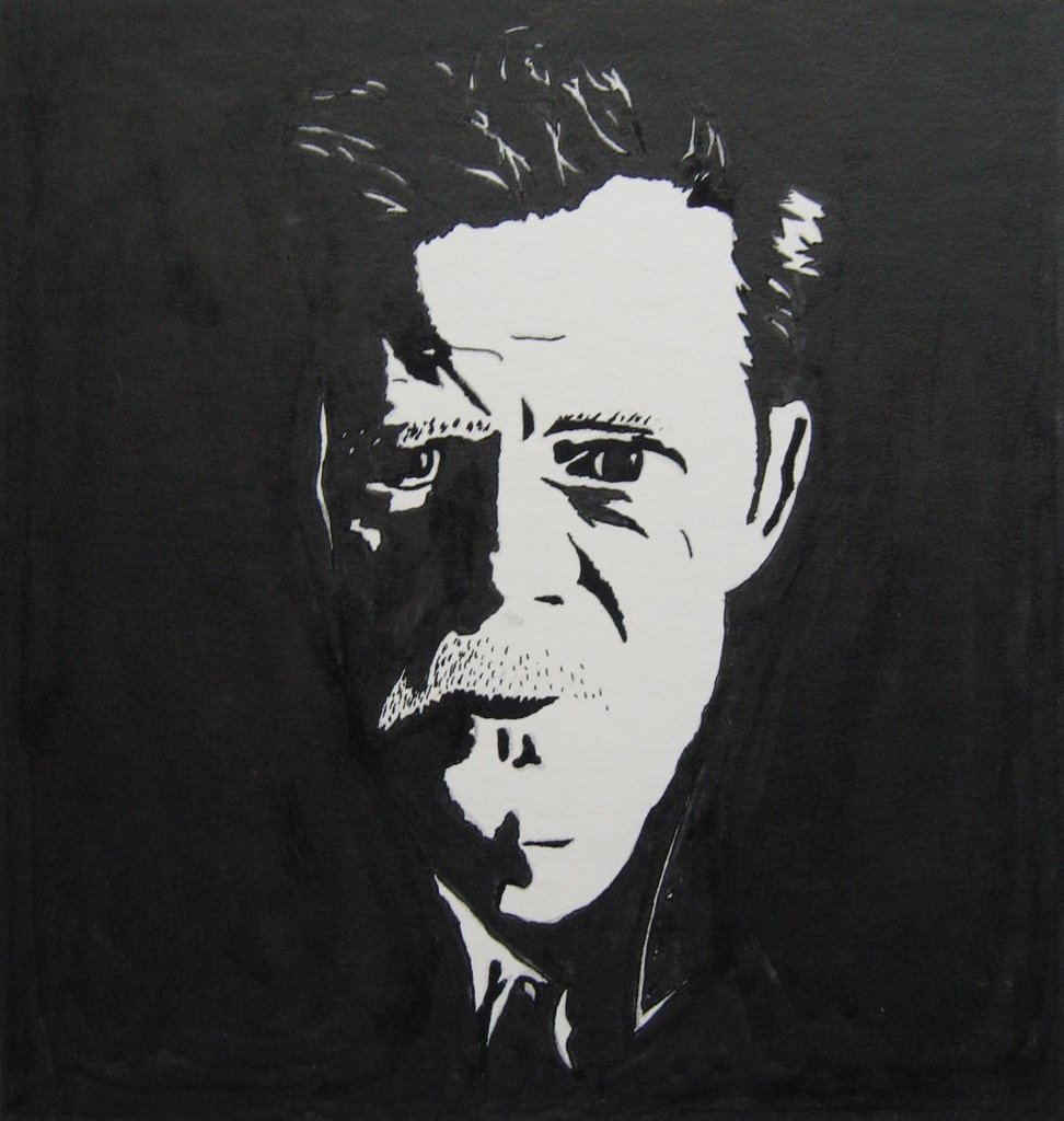
And second, a black and white side-lit portrait of William Macy, you may have seen him in Fargo or a dozen other movies. This one went much faster than the cross-hatching, but I still think it's a somewhat lame project because Adobe Illustrator can do this very same thing in about 10 seconds. I don't see what the benefit of doing it by hand is. (This is one of the reasons I'm focusing on digital Illustration.)

Anyhow, I have to do one more in each of these styles by the end of the weekend, so expect to see more like these soon.

~Adam

Friday, December 22, 2006

A Peaceful Scene

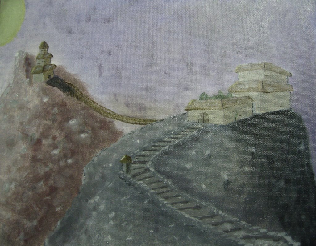
I did a painting of a temple on a mountain much like the drawings I posted here and here. I felt it was appropriate for this week's Illustration Friday topic, "peace".

Temple on the Mountain
11"x14"
oil on canvas board

~Adam

Tuesday, December 19, 2006

Ink Monsters

Inspired by Stefan G. Bucher's DAILY MONSTER (which is really cool and I recommend everyone check out) I did a few quick little monster drawings with ink. The initial form is created by putting a drop of ink on the paper and blowing through a straw to create organic shapes. Then it's just a matter of what your imagination sees. Fun and easy.


~Adam

Thursday, December 14, 2006

Finished Triptych

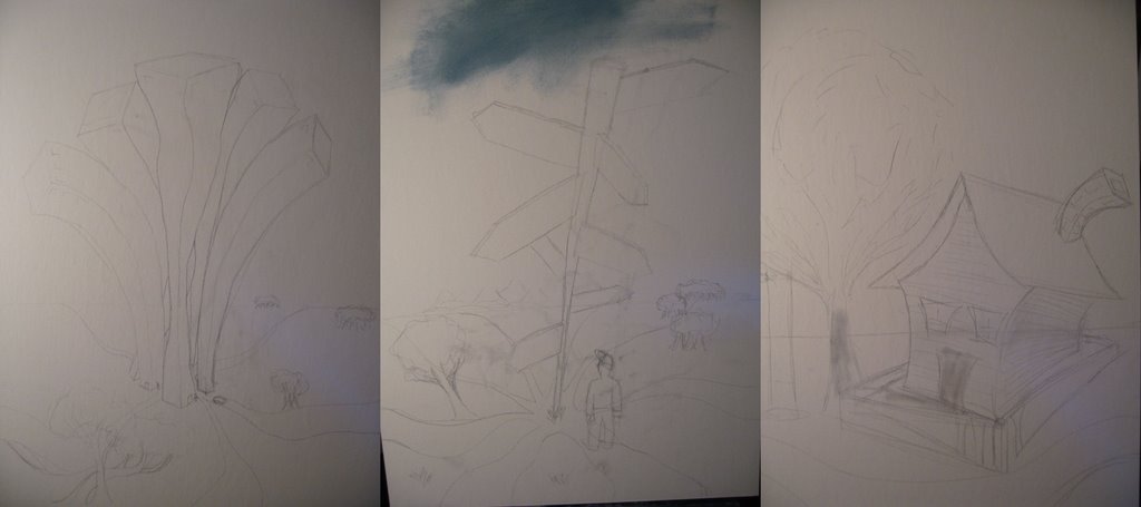
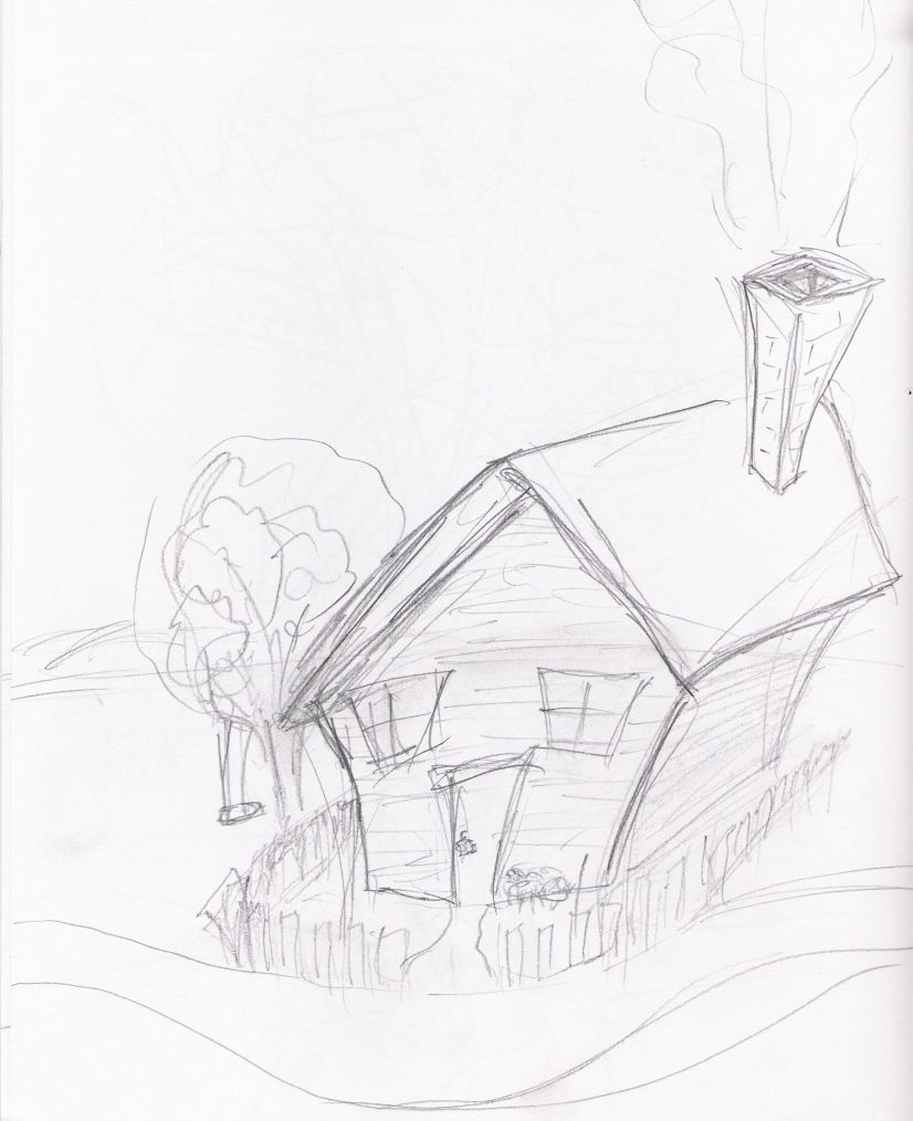
Well it's been several weeks, but I've finally finished up the triptych that I posted sketches for a while ago.

I started off as I do with most paintings, drawing right onto the canvas. For this project I used canvas boards, mostly because they're cheaper.
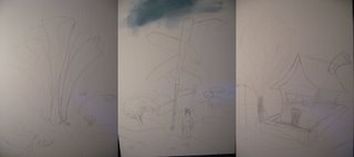

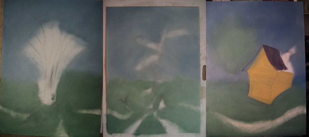
I began painting right over my drawings here. I tried to go back and forth between each piece so they would all develop at about the same rate and keep some of the same colors.
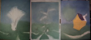

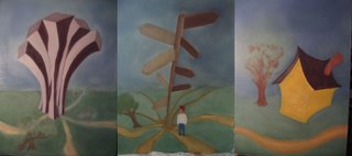
Here they are with all the major elements.
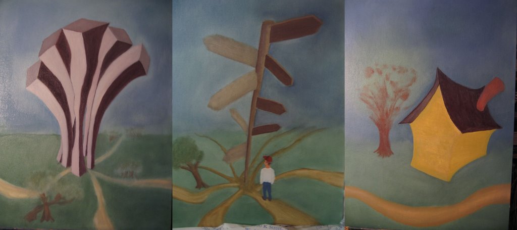
And finally after I added details, this is what I ended up with.
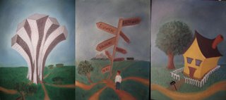

The piece has a theme of confusion and being lost in life, which is a very serious idea and thought it would be interesting to put that against a cartoony, light-hearted style, adding more to the confusing feeling of the work. Obviously the crossroads piece holds it all together and most clearly relates that theme. The city piece is meant to give a busy and overcrowded kind of feeling. The buildings can't even fit into thier own area. And finally the home is supposed to be the most peaceful of the scenes, yet nothing is perfect, hence it has the darkest sky, a more subtle discomfort.

I also had the idea of making a larger series of paintings with this structure (you may notice the edges of each are nearly identical) that could be placed and rearanged in any order, giving it the ability to take on varying stories and themes dependant on the configuration. We'll see...

~Adam

Monday, December 11, 2006

Captain Hal's Followup

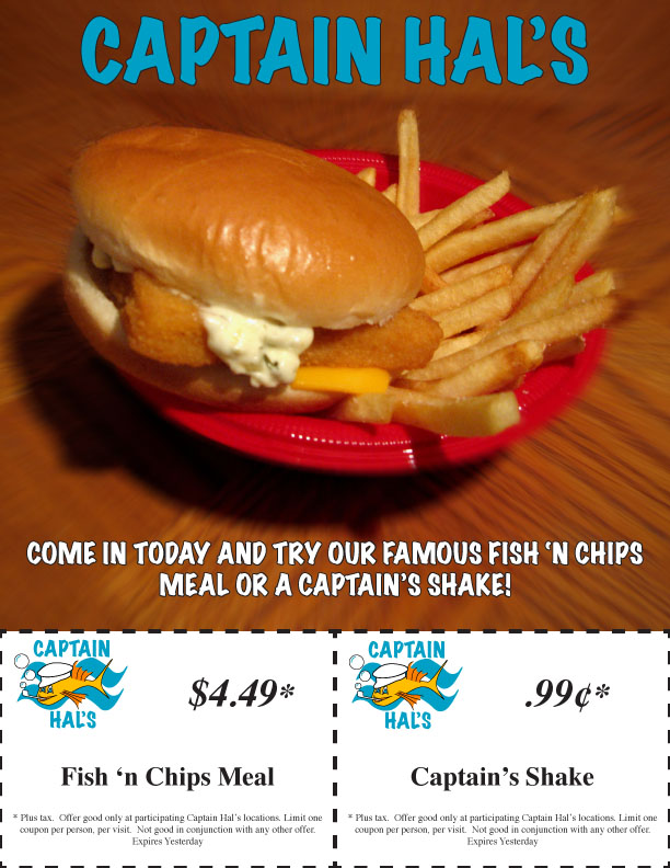
We're at the end of the semester so I've been pretty busy with stuff, sorry about the lack of posts. Here's my suite of items I created for Captain Hal's.

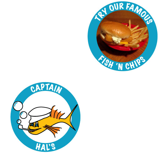
First, a flyer that you might find in a newspaper. I took the photo myself with a McDonald's fish sandwich and fries. I wanted one of those red basket things they use at some restaurants but the bowl was all I could get a hold of. Did a tiny bit of photo editing in photoshop then slapped it into the InDesign page I made and voila.


Here's some coasters. No explanation needed.


And finally a kids menu / placemat. The final version had a bunch of bubbles placed randomly on it to make it look more festive, but I forgot to email myself that file, so, whatever.


That's all for now.
~Adam
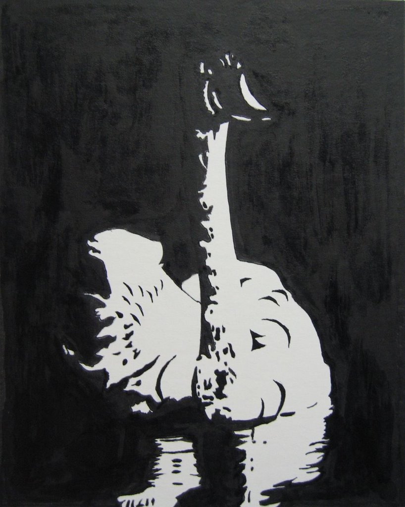
(oh, and just in case you were wondering about the "Captain's Shake" click here.)

Tuesday, December 05, 2006

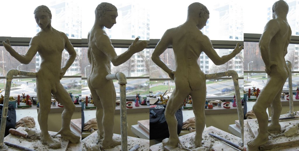
Clay People - Figure 4

Looking back, I seem to have forgotten to snap shots of my third figure, oops. Well, you didn't miss anything. I felt like that was my weakest one so far... and my teacher seemed to agree. Awesome.

Anyhow, here's my recently completed 4th figure. I think it's my best yet, but for some reason the teacher doesn't think it's as good as the "B" I got for figure 2. Well, whatever, sculpture is not really my thing.


As for the triptych painting I'm working on, well, I'm still working on it. The final version of it is due next Tuesday by the latest, so I'll have something up here by then. Good news, my friend saw my progress on it over the weekend and he said he really liked it, and he has before said that he doesn't like art. So it got a response from someone that usually doesn't respond, I thought that was pretty cool.

~Adam

Wednesday, November 22, 2006

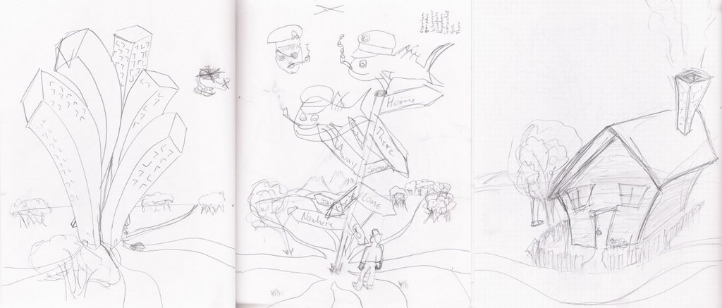
Triptych Sketches

My next painting is going to be a triptych on canvas board. I got the idea as I was driving home from a friend's last night and had to put down some sketches at around 3am. Here's what I have so far. The fish in the sky for the second panel were ideas for my Captain Hal's logo, obviously they won't be in the painting :)


I started working today, hopefully I'll have something I'm happy with in a few weeks.

~Adam

Monday, November 20, 2006

Liberty

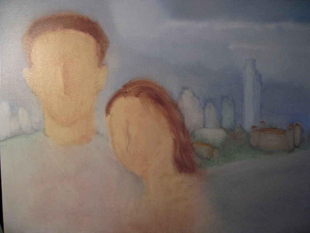
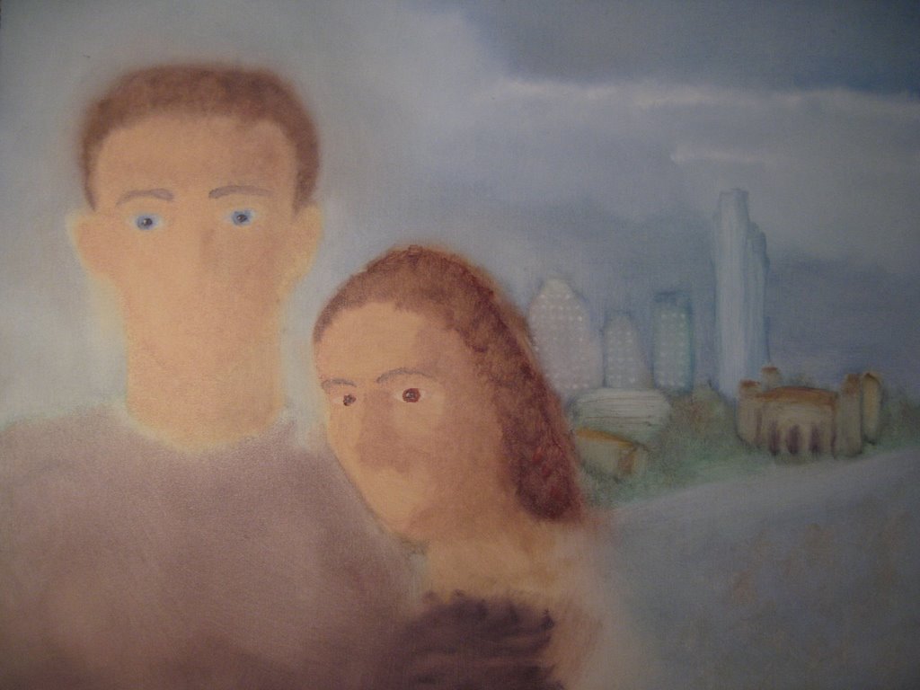
I recently went on a daytrip with my family to see the Statue of Liberty and Ellis Island. It was a good time, and educational. The buildings on Ellis Island looked awsome, but we were moving around to much for me to be able to take the time to sketch them. Anyway, I decided to use one of the photos I had take as a background for my next painting. It was taken from the top of the Statye of Liberty's pedestal. We could only get so many tickets to go up there, and Anne, unfortunately, was not one of the few that could go up. But this is basically what I thought would be a cool tourist-y photo.

You can see my references taped to the mirror in the first shot, the pose is from a photo of the two of us on a cruise we took a couple years ago. Though I'm only using that for the layout, I am painting the faces from life, hence the mirror, and I had Anne pose while I worked on hers. Obviously I've again shown some of the progression as I've worked on it. I like seeing it, so I'm going to continue doing it.


I've been working on this on and off for the past week but I really need to get started on my final project so I'm going to put this aside for now, hopefully I'll get back to it and finish it soon.

~Adam